When talking about rebranding, it is important to start with what is implied by the word.
Rebranding is all about building a brand image in the minds of consumers.
The main task of rebranding is to ‘refresh’ the brand by adding certain values and innovative changes.
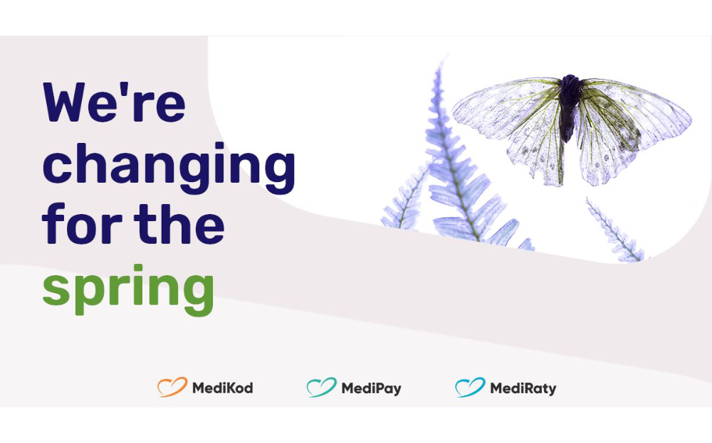
We – LM Pay, as part of our rebranding, have unified the three forms of deferred payment we offer: MediRaty, MediPay, MediKod.
This all took place under the banner of the special ‘Changing for Spring’ campaign, which aimed to offer clinics the opportunity to offer their patients the chance to download MediCodes.
As a company with many years of experience, we see that deferred payment systems increase the profitability of clinics.
In addition to unifying the names of the three forms of deferred payment, the LM Pay rebranding campaign also involved a colour change.
The new pastel colours combine and resonate with the company’s core values:
- blue is the symbol of peace, purity and security
- turquoise is primarily associated with relaxation, tranquillity and a positive attitude
- orange is a highly energetic colour, which carries the symbolism of warmth, security and innovation. In addition, orange also symbolises the pursuit of a goal.
#lmpay #MediRaty #MediPay #MediKod
Compiled from LM PAY S.A.’s Linkedin profile
